Greenland: I was in the pool!
Denominator, go Mercator
Submitted 3 months ago by fossilesque@mander.xyz to science_memes@mander.xyz
https://mander.xyz/pictrs/image/341575b3-b1b7-4aef-a233-060fac189495.jpeg
Comments
MajorMajormajormajor@lemmy.ca 3 months ago
acockworkorange@mander.xyz 3 months ago
There’s shrinkage!
DaddleDew@lemmy.world 3 months ago
sbeak@sopuli.xyz 3 months ago
Map Men Map Men Map Map Map Men Men!
protogen420@lemmy.blahaj.zone 3 months ago
Men map men map men map!
tomiant@piefed.social 3 months ago
So, these men… What is their area of expertise?
Tehdastehdas@piefed.social 3 months ago
This post didn’t need to include an ad for x-dot-com.
BarneyPiccolo@lemmy.today 3 months ago
This is why Trump wants Greenland so bad. He sees it, and says “It’s big, I want it. Get it for me!” and gets all Veruca Salt about it.
All because he doesn’t understand what a Mercator Projection is, on account of he beat up some nerd to do his homework that day, like every day.
ameancow@lemmy.world 3 months ago
A lot of conservatives have wanted Greenland for a long time as some throwback to US imperialism and very outdated cold-war era defensive posturing.
Stephen Miller threw the idea at Trump and wormtongued it as some idea that claiming the country would be some monument to Trump’s legacy that would outlive all the scandals, and that’s all the old turd wants, he just wants adoration and cheering crowds, that’s his entire ethical framework.
What does Miller want from it? No idea, he’s utterly, inhumanly insane. He’s just literally an Elliot Rodgers in a suit who managed to get way too much power.
BarneyPiccolo@lemmy.today 3 months ago
The Dems need to make a major case out of PeeWee Himmler for the Midterms. Expose him, and add him to the list of horrors that we are running against.
RizzRustbolt@lemmy.world 3 months ago
wormtongued
I don’t want people associating Stephen Miller with a Brad Dourif character.
Mr. Dourif is a saint, and mensch, and doesn’t deserve that smoke.
crank0271@lemmy.world 3 months ago
Hmm, so the Mercator projection makes things look larger than they are? I think I’ve got an idea for another use for it… 😏
Pwalabwa@quokk.au 3 months ago
Is that it?
makyo@lemmy.world 3 months ago
Your penis isn’t far enough north for it to help
crank0271@lemmy.world 3 months ago
All right, well first I may need to see a doctor.
HeyThisIsntTheYMCA@lemmy.world 3 months ago
Yet
MajorMajormajormajor@lemmy.ca 3 months ago
Slightly enlarging something that is microscopic doesn’t change much.
mnemonicmonkeys@sh.itjust.works 3 months ago
10 x 0 = 0
ZpbkPEcaHhIveqdR@lemmy.world 3 months ago
I don’t think that’s the true size. You’ll find all those countries are actually a lot bigger than presented on that map and scaled down to fit on a screen
MashedHobbits@lemy.lol 3 months ago
You don’t know how big my screen is.
jaennaet@sopuli.xyz 3 months ago
What is this map, a territory for ants?
NaibofTabr@infosec.pub 3 months ago
This just in: projection requires distortion.
sik0fewl@piefed.ca 3 months ago
Not if you project it onto an oblate spheroid.
Zerush@lemmy.ml 3 months ago
chiliedogg@lemmy.world 3 months ago
Yes, but blue (Mercator) preserves direction and shape, which were all that really mattered for navigation by sea, so Mercator was a fantastic projection for centuries.
And we still use it today for smaller scale areas, since it does a remarkably good job at preserving all 4 features (shape, area, distance, and direction) close to the map origin line. Universal Transverse Mercator is a system that has 60 zones of Mercator turned sideways.
The reason it’s Transverse is because, unlike lattitude depending on a defined equator, longitude has an arbitrary meridian, so by turning the map sideways we can move the distortion point, and any map area that doesn’t stray too far East or West will be very accurate.
Think of trying to map something like Chile or Florida, where the area of interest is pretty far North to South, but not East to West.
huppakee@piefed.social 3 months ago
There also an interactive version of this, also a bunch of copies (not sure if this is the original, but i believe so): https://thetruesize.com/
Pyr_Pressure@lemmy.ca 3 months ago
How much do you wanna bet Trump wouldn’t be so gung ho on Greenland if he saw this map? He probably thinks he is going to double the size of America.
Jankatarch@lemmy.world 3 months ago
Can they spot grrenland on the map tho?
piccolo@sh.itjust.works 3 months ago
Trump handlers want the resources. Trump wants it because his ego is inflated by mercator projection.
Knightfox@lemmy.world 3 months ago
Eh, I doubt that’s the case. It could be a 20 m^2 area, but if it had Greenland’s resources they would want it.
marcos@lemmy.world 3 months ago
Did it cut out the European portion of Russia?
mEEGal@lemmy.world 3 months ago
No, it just can’t be scaled down and somehow kept in place at the tame time
LodeMike@lemmy.today 3 months ago
Its distorted on the Mercator projection quite a bit because of its width. So the true shape looks very different presented like this.
ChaoticNeutralCzech@feddit.org 3 months ago
TL;DR Somebody made an awful mistake rendering this map.
It’t not exactly the European portion but most of its recognizable parts (Kola peninsula, Caucascus…) because of the horrible SVG compression that deleted vertices presumably by count rather than keeping the most significant* ones. Just look how the Mercator/shrunk versions differ from each other and from an actually good map!
* A simple illustration would be Colorado, originally defined as a (Mercator) rectangle (between meridians and parallels) but ending up a 697-sided polygon (still way fewer than most surveyed administrative areas that size) largely because of surveying errors. However, if you pick the 1ˢᵗ, 175ᵗʰ, 349ᵗʰ and 523ʳᵈ vertex, you don’t approximate the shape nearly as well as by picking the 4 corners of the defining rectangle.
Image
And because corners are always mostly convex (they have to be because turns add up to 360° for closed areas), this compression will remove area more frequently than add it. This makes the map quite disingenuous (maybe not intentionally), as it amplifies the effect OOP was trying to show.
If I were a full-time Lemmy commenter, I’d download the Colorado polygon from OSM, import sone geo-libraries into Python and do all 174** combinations of picking the 1ˢᵗ, 175ᵗʰ, 349ᵗʰ and 523ʳᵈ vertex, visualize each quadrilateral as a video frame and** Technically 697 options because 697 is not divisible by 4. But only ¼ of them are fully distinct, as every consecutive 4 maps have an identical starting vertex and just differ in which pair of vertices is 175 apart as opposed to the normal 174.
Hackworth@piefed.ca 3 months ago
AnnaFrankfurter@lemmy.ml 3 months ago
Maybe show this to taco trump and he’ll realize Greenland is small and level it be.
DeathByBigSad@sh.itjust.works 3 months ago
level it
INSTRUCTIONS UNCLEAR, ICBM SEQUENCE INITIATED
☢️🚀⤵️💥🌇
(You made a fatal spelling mistake, you killed Greenland, its all your fault!)
BarneyPiccolo@lemmy.today 3 months ago
I need a Mercator Projection in my pants.
AngryCommieKender@lemmy.world 3 months ago
That close to your equator, wouldn’t it have the opposite of the intended effect?
BarneyPiccolo@lemmy.today 3 months ago
I only know that it helicopters in the opposite direction when you cross the equator.
BradleyUffner@lemmy.world 3 months ago
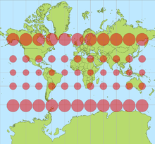
Why is the difference only extremely pronounced in the northern hemisphere? If I understand the math behind the projection correctly, the equator should be true scale, and things should vary more the further north AND south you go.
This image shows the extreme southern latitudes to be almost equal to their true area. Is the image wrong, or am I misunderstanding something about the projection?
lvxferre@mander.xyz 3 months ago
This map is clipping a good chunk of the Southern Hemisphere. When you include it, you also notice the same distortion:
Note how it looks like Antarctica (14*10⁶km²) is 1/4 of the globe, even if it’s actually smaller than South America (18*10⁶km²).
bort@sopuli.xyz 3 months ago
Hupf@feddit.org 3 months ago
SkaveRat@discuss.tchncs.de 3 months ago
Antarctica is missing, which skews it heavily towards north
bdonvr@thelemmy.club 3 months ago
It doesn’t show Antarctica, but also there’s just more stuff in the far north than the far south (if we aren’t counting Antarctica)
gigachad@piefed.social 3 months ago
FinjaminPoach@lemmy.world 3 months ago
Interesting how much closer kazakhstan (and by extension, china) is to europe when you see it like this. Like if the red outlines were all smooshed back closely together.
huppakee@piefed.social 3 months ago
Crossing the globe north to south is the same distance as east to west, but since it is folded open on 2d maps it looks as if the earth is wider then it is higher. In this projection that means the map is stretched more horizontally than vertically, if i understand correctly.
bdonvr@thelemmy.club 3 months ago
Crossing the globe north to south is the same distance as east to west
Not true, the earth isn’t a perfect sphere. Though I guess I’m just being nitpicky because I looked it up and it’s only ~27mi/43km longer along the equator.
FinjaminPoach@lemmy.world 3 months ago
In this projection that means the map is stretched more horizontally than vertically, if i understand correctly
You’re right!
SlurpingPus@lemmy.world 3 months ago
Now guess where China builds railroads for exports to Europe.
ComradeRachel@lemmy.blahaj.zone 3 months ago
How can it be the true size if it’s still a projection on a 2d surface? I thought could only see the true size on a 3d globe.
vithigar@lemmy.ca 3 months ago
True size is possible just fine on a 2D surface. For both too large and too small to be even possible there must exist some transitional point where the size is correct.
You cannot have both the size and shape correct at the same time. Having the correct size means distorting the shape, and vise versa. One is the other can be correct, but never both.
HeyThisIsntTheYMCA@lemmy.world 3 months ago
It’s a curved 2d surface
Liz@midwest.social 3 months ago
It’s a much closer approximation, anyway.
ComradeRachel@lemmy.blahaj.zone 3 months ago
Also I just noticed that the borders no longer line up and it looks like there is ocean in between which isn’t the case. So I shows the size more accurately but is not useable as a map really.
melsaskca@lemmy.ca 3 months ago
If I have to shower in gym class I want the mercator-projection showers.
WhiskyTangoFoxtrot@lemmy.world 3 months ago
But then everything near the equator will be smaller.
Natanael@infosec.pub 3 months ago
This map won’t be centered on the equator
stevedice@sh.itjust.works 3 months ago
Do you shower in a handstand?
yermaw@sh.itjust.works 3 months ago
Is Africa the only one here not stuffing socks down their trousers?
Eiri@lemmy.ca 3 months ago
Doesn’t that kinda make Canada look smaller than the US?
someguy3@lemmy.world 3 months ago
Jankatarch@lemmy.world 3 months ago
Damn Indonesia is huge.
ILikeBoobies@lemmy.ca 3 months ago
The oceans are huge.
LainTrain@lemmy.dbzer0.com 3 months ago
I’m curious if anyone ever made a “Super Mercator” projection, something where “ze west” is even more exaggerated and some continents even more disproportionately reduced missing/removed to own the libs. It kinda sounds like something governments would do/people would like nowadays.
doingthestuff@lemy.lol 3 months ago
Brazil could be the world’s superpower but they have other priorities.
scala@lemmy.ml 3 months ago
Anyone know of a 2D map print of true size? All I’ve found print wise is Mercator or other such variations.
YiddishMcSquidish@lemmy.today 3 months ago
Whatever happened to that wavy “W/M” looking one I remember seeing on some news stations when I was younger?
Smart_Penicillin@lemmy.world 3 months ago
Show this map to Trump. I will not want Greenland anymore.
CannonFodder@lemmy.world 3 months ago
Acquiring Greenland would move the USA up 2 places in the list of largest countries (past Canada and China). That’s probably why he wants it.
thejml@sh.itjust.works 3 months ago
He just wants it ti deflect from the Epstein Files.
tomiant@piefed.social 3 months ago
It is quick becoming a very important strategic hub in the Arctic due to shipping lanes opening up due to global heating. Greenland is also continuously opening up to natural resource extraction as ice disappears, and they have vast quantities of a lot of very valuable shit under the ground that keeps getting easier to access for the same reason, like rare earth elements, oil, natural gas, copper, gold, zinc, uranium, the list goes on…
Controlling and exploiting that land is a major strategic interest for all the big (and small) powers.
Elgenzay@lemmy.ml 3 months ago
Wait till he finds out it’s not green at all!
EtAl@lemmy.dbzer0.com 3 months ago
He knows it’s all ice. That why it’s called Iceland.