I miss the sideways swiping in the all apps. I manually changed it, but new apps have to manually be put in place. This new UI suuuuuuuuuuucks. I wish that I could change it back.
Android updates: thanks I hate it.
Submitted 1 year ago by Clinicallydepressedpoochie@lemmy.world to [deleted]
https://lemmy.world/pictrs/image/254fe9d8-9976-42e7-86ee-25f9ad2e08b4.jpeg
Comments
Sunflier@lemmy.world 1 year ago
kamen@lemmy.world 1 year ago
Install a custom launcher - this way you can mostly expect it to stay consistent across major upgrades.
I understand the reasons for liking the stock experience, but that comes with the risk of getting an overhaul every once in a while.
mutter9355@discuss.tchncs.de 1 year ago
I think most of the update is pretty okay (unpopular opinion: I kinda like the new battery icon), except for the notification panel, which they completely ruined.
It used to be that persistent notifications (which need to be there so apps like tasker and kde connect don’t get killed) were neatly at the bottom. Now they’re just randomly mixed in with the other notifications, so chats, emails, etc.
Jumi@lemmy.world 1 year ago
Laughs at you in Galaxy S10
norra@lemmy.world 1 year ago
For anyone on Samsung, I’ve also been fighting with with the OneUI changes, look into the GoodLock app from the Samsung App store, it’s published by Samsung and helps you take (more) control over how attributes behave and act, along with changing things like the Lock Screen looks and what shows up and how. I can give more info if anyone wants or provide screenshots here if anyone would like
Here’s a link to the app in their store apps.samsung.com/appquery/appDetail.as?appId=com.…
frostysauce@lemmy.world 1 year ago
Whelp, my Galaxy A16 is not supported.
norra@lemmy.world 1 year ago
I’m just theorising here, but I wonder if you could download the apk externally and try that way, I’m thinking they could just be software locking you out app store side
priapus@sh.itjust.works 1 year ago
Samsung updates, they ruin android more and more with each one. The quality of the ROM an android comes with is a very underrated thing to consider when buying. Pixels are very close to stock android. Nothing is also good, farther from stock but the changes are for the better imo. OnePlus was good last time I had one, but not sure if they still are.
Krauerking@lemy.lol 1 year ago
I hate that my music player is now relegated to a tiny nub at the bottom of the lock screen that defaults now to google ads for sports betting unless you turn it off.
Also my phone now randomly vibrates every so often, just gently enough to think it was imagined and I think it’s to drain the battery faster to push people to buy a new phone. But that’s just conspiracy from how garbage the rest of this update has been.
norra@lemmy.world 1 year ago
Hey so I had a similar problem with the random vibrations, I found that the update turned on Notification Reminders in settings for texts and missed calls. I’d double check those settings around that and I hope it helps you
Krauerking@lemy.lol 1 year ago
“Alert when phone picked up”
Was the name of the setting turned on. In the motion settings.
Still not sure how they could have named that harder to find without writing it in Korean.
applemao@lemmy.world 1 year ago
I AM STILL PISSED ABOUT THIS FORCED UPDATE. the second a linux phone is usable daily I will buy one. FUCK SAMSUNG
Swedneck@discuss.tchncs.de 1 year ago
just get a phone with lineageos support?
JTskulk@lemmy.world 1 year ago
Sounds like you already have one. Samsung phones are pretty bad though.
Rin@lemm.ee 1 year ago
There’s a lot of options. Volla phone, fn(x), fur something. You can use a google pixel 3a to put ubuntu onto. I’ve found that most of those phone have mid specs, unless you’re really wishing to dish out.
CCAirWater@lemm.ee 1 year ago
Would the Google pixel not retain some line to Google? I’ve been leaning more and more towards getting away from Google and Microsoft. With Linux, I’m scared I’ll have an unsecure system just by virtue of not knowing dick about Linux except the little coding I’ve taken courses on that barely scratched it.
Only reason I got Samsung was the cameras on the S22 or 24 or whatever it is I have. Pixel has good cameras, I’ve heard, but it’s entirely Google. Does putting Ubuntu remove all that…?
Sorry if not the place to ask.
state_electrician@discuss.tchncs.de 1 year ago
I just got a Samsung phone and haven’t seen anything besides the current version and for me it’s fine.
fermuch@lemmy.ml 1 year ago
People tend to overreact when something changes. It is normal.
Wizard_Pope@lemmy.world 1 year ago
Yeah I am sticking with my custom rom until the phone dies. Then probably getting a Sony phonr because those apparently have a no nonsense android on them.
Swedneck@discuss.tchncs.de 1 year ago
get a pixel and install lineage, it’s quite easy (you just need to fiddle with adb a bit) and you can achieve a 95% flawless experience. only thing that doesn’t just work for me is the fucking mcdonald’s app
Wizard_Pope@lemmy.world 1 year ago
I have an older phone with lineage. Currently using crdroid because I chose badly and nobody is really making custom roms for my current phone. I am not buying a pixel just because.
Rin@lemm.ee 1 year ago
Bootloader unlockable for my past 2 sonys. Plus headphone jack ftw
goldenquetzal@lemmy.world 1 year ago
I have two Sonys and love them both. I like that they’re thinner so it’s easier to hold, too. Still have headphone jack and side fingerprint reader.
Wizard_Pope@lemmy.world 1 year ago
Good to hear. I had a sony a while ago. Xperia Z1 compact I think. Great little phone it was. Sadly they now only make really high end phones anymore.
Etterra@discuss.online 1 year ago
Yeah I’ve bought my last Samsung. These over-redesigned UIs that nobody asked for piss me off. If I wanted ugly Apple trash I’d buy ugly Apple trash.
Kcap@lemmy.world 1 year ago
I hate the single page scroll app drawer. I enjoy being able to swipe up to toggle between home and the app drawer. If you keep the single page scrolling drawer, you can’t swipe up to get back to home. You can change this and revert to pages like we had before, but for some unholy stupid fucking reason, you can’t sort it alphabetically. Like, really? I’ve had to manually reposition all of my apps, and for some reason the toggle seems to be pretty janky to settle an app into the place you want it, so insanely annoying. Add alphabetical sorting back, come on. Basic shit.
Shamber@lemm.ee 1 year ago
[deleted]Kcap@lemmy.world 1 year ago
I tried that but unfortunately when I sort alphabetically it just returns to the single scrolling page. When I go back to custom sort it’s still in random order. Can’t believe the oversight on this basic feature. Thanks for the advice though.
Adulated_Aspersion@lemmy.world 1 year ago
Don’t forget the search is now at the bottom of the app drawer instead of the top like it used to be.
FourWaveforms@lemm.ee 1 year ago
sometimes it’s chill to just move a component around randomly, if a ux designer feels like “it just vibes different.” the modern equivalent of feng shui, or giving a shit about crystals
Dreaming_Novaling@lemmy.zip 1 year ago
Oh boy, can’t wait to see this garbage on my Samsung Tab 9. My mom upgraded me from my dusty, way beyond eol Kindle Fire that I had, cause I I really do on it is watch YT and read/web browse. Was excited, until I realized I couldn’t custom ROM it like my precious Pixel.
Like another comment said, Samsung/One UI is truly the Apple of Android, and it’s dogshit. So much bloat that I had to disable/delete, random UI changes that oversimplify/water down personality, stupid settings I will literally never use, etc.
The best I could get is a stock Android GSI, but I’m not sure if potential bugs and battery life issues would occur, and I don’t want to root.
FourWaveforms@lemm.ee 1 year ago
Samsung caught me early (like 2010 or early 2011.) Years later I got a Pixel and was astonished at how much stupid shit isn’t in regular Android. Also looking up how to change settings on Google suddenly started being way easier.
zqps@sh.itjust.works 1 year ago
My dad bought a new tablet. I spent over an hour debloating it with ADB just to get it to a usable state.
I really don’t know why people love their products. Even the performance out of the box is utter shit until you disable the virtual RAM.
Mwa@lemm.ee 1 year ago
same here with my A55 luckily i still have Oneui 7.1
SkyJuice@lemmy.world 1 year ago
I still use a note8 with OneUI 1.0 and android 9 lmao
13igTyme@lemmy.world 1 year ago
Motorola is the only android for me. They can easily last 6 years plus.
Dreaming_Novaling@lemmy.zip 1 year ago
I loved my 7G Play like it was my own child in middle school. It was my third phone, and not a hand-me-down like the Note 4 and the iPhone 6? that I had previously. Kids used to green bubble shame and be like “OMG wtf is a Motorola?!?!” but I loved it. I didn’t do too much crazy shit on it cause I still was a less-curious middle schooler, but I did get a cracked version of a wallpaper app to use this special Persona 5 background, and I loved it. I didn’t love my next hand-me-down iPhone X nearly as much, in fact I hated it so much in highschool that once I graduated my mom got me my current Pixel 8a as a gift.
I tested putting a custom ROM on my old Motorola to prepare for doing GrapheneOS on my Pixel (silly, since they literally have a button to do it for you on the website) and once it loaded up LineageOS it felt like Christmas again. I seriously almost considered using it again, and was just so happy to scroll through it lol.
Redredme@lemmy.world 1 year ago
As an oppo user I can only say: you’re wrong. You’re very wrong.
Samsung one UI is a godsend compared with this… This … shit.
Popups, tracking, insane ui choices. Half of the shit doesn’t work behind a pihole which in itself is damning enough. Everything feels bolted on. Everything feels like its only there to check boxes. Nothing feels natural. Gestures here but not there. Apple style features in Android so half of the time you’re totally lost: does this option still use standard Android logic or is this rewritten as an apple clone?
I really feel tricked into buying this phone. Excellent reviews but the user experience is very lacking. Maybe all of the reviewers are apple users and are happy to see all this shit in Android but I for one am lost. I use Android because i hate the apple way of doing things. If i wanted an apple device I would’ve bought an apple device.
I kept it because i thought it would get used to it. I did not.
nope@jlai.lu 1 year ago
Mwa@lemm.ee 1 year ago
Idk if someone made a rom for my A55 lol
nope@jlai.lu 1 year ago
You could look for that model on xdaforums.com, that’s my go-to place for anything mobile devices and custom ROM related
lmuel@sopuli.xyz 1 year ago
OneUI means Samsung.
Samsung means: can’t do shit in the US, limited shit outside of the US. AFAIK most custom ROMs, especially for higher end Samsung’s are OneUI based. They also make it difficult (or impossible?) to use VoLTE/VoNR with custom ROMs because of their own proprietary IMS stack
DJDarren@sopuli.xyz 1 year ago
I’ve been gifted a few old Samsung S3s for using in our workshop at work. They’re all the same model, but it turns out that one of them runs a different processor. So I’ve been able to put LineageOS on two of them, but the third refuses to unlock.
Meanwhile, I moved into the world of Android a few months ago after having iPhones since 2009. Within half an hour of taking delivery of my Pixel 9 it was running GrapheneOS.
Fuck Samsung.
Exusia@lemmy.world 1 year ago
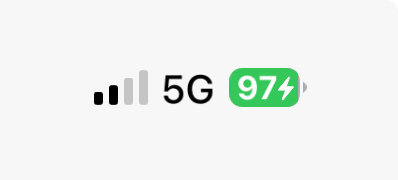
I hate the battery not looking like a battery. Minor complaint tbh, I dislike it but I might come to like it.
Notifications now stop at 3. Why. Why the fuck. I moderate discord and modmail pings me 17 times an hour. I want to see that I have a text in Notifs, and now it just shows 3 discord icons when opened - I have to open the full tray. Negative user experience item
The split trays was fucking stupid. I have a fold and I STILL hate it. Fixed it in settings. Negative user experience to have forced it rather than asking. Moderate item since you can reverse it.
Adding 6 “quick items” at the top of the Tray is nice, since they fucked with the tray. It’s like…“we know we made the ui worse so here have quick access to 6 items you actually wanted as an I’m sorry present” The whole Tray is very iPhone. I did not pay for a Samsung to get an iPhone. People are welcome to like them, I’m not here to hate. But I specifically bought a Samsung phone with Samsung styled ui - if I wanted this feel id have gotten an iPhone.
Spotify now has like this…loading screen? It tells me when i have no service and won’t even open the app if I’ve lost internet (data off and walk too far from wifi) Difficult to see the upside to this “live status”. Minor poor user experience.
Google assistant has been removed from the bottom left swipe. Holy shit i hated that move. Why the fuck was it in the bottom left in the first place. Even worse, now it’s fucking Gemeni. Ai is actually ass. Turned it off and disabled it. Disabled the tile in my apps. Putting AI on my phone is a hard negative especially with the next item
Google assistant now no longer works. It just makes Google searches. I now no longer have a hands free way to tell my phone to “call (contact)”. Gemini did not recognise this command and is part of why I disabled and removed it. Now GA doesn’t either - continuing the trend of making GA more and more useless. This is such a hard negative actually has me considering turning Bixby on. Using the full phone book when I used to be able to tell my phone to call people is such a shit maneuver. Very, very poor user experience.
App drawers looks clean. Looks smooth. Reorganization is fine. Positive user experience.
They changed something about Home Screens but I dont know what. I feel like they shrank the icons? Gave me an extra row? Something. Feels off now. Somewhat poor user experience because the user is left feeling paranoid about what did or did not actually change.
voice-to-text was removed from the keyboard and then hidden and moved to the bottom left last. You know, the same spot Google assistant was also placed last update. Actual dogshit user experience hiding the VTT and making me dig through the internet to put it back. The fuck was this choice.
Overall negative and has me rethinking keeping with the Fold line given their price. If anyone has a Launcher to fix some of these issues or to restore voice text making calls, I’d appreciate it.
Oka@sopuli.xyz 1 year ago
Yes, icons got smaller and a row was added. They also changed the weather app to be scalable (ie not every icon needs to be 1:1 squares, they can scale now).
I was able to merge everything on my second page into my first page, so now Inly have 1 “desktop”-like page with folders
MrLuigi002@lemmy.world 1 year ago
Oka@sopuli.xyz 1 year ago
throwawayacc0430@sh.itjust.works 1 year ago
I hate the battery not looking like a battery.
Welcome to One UI 7 🙃
rmuk@feddit.uk 1 year ago
I like it. The “progress bar” style fill is nice and clear, and it’s so much better than having an icon with a number next to it. “BuT iT dOeSn’T lOoK LiKe A bAtTeRy” what, do you think your phone is full of AAs? A plain oblong is actually closer to the mark.
Strider@lemmy.world 1 year ago
For me it’s not about liking. My eyes aren’t as good as they were and the far worse contrast combined with the smaller size worsens the readability significantly.
(Don’t rush but you’ll get there.)
Clinicallydepressedpoochie@lemmy.world 1 year ago
I just hate the greyed out bit. To much like it’s partially selected.
Tja@programming.dev 1 year ago
I don’t mind it. Wish the notifications were more compact, but that’s about it.
kerntucky@infosec.pub 1 year ago
If you pull down and tap the little pencil to edit, then go to panel settings, you will find the option to change the pulldown menus from separate back to together.
FollyDolly@lemmy.world 1 year ago
Oh fuck, I hate this too. Fucked up the video player and a bunch of my settings as well. Why is everything so round!? Why did they fuck up my clock widget SO BAD!??
Mac@mander.xyz 1 year ago
One UI 7 is the worst update I’ve ever suffered in my entire life.
Win7->10 wasn’t this bad.
A_Random_Idiot@lemmy.world 1 year ago
I was given an old Galaxy tab 8 on friday. I played with it for a while, and it was super snappy and quick.
Then it updated
then updated again
then updated again.
And finally again.
Ended up with OneUI6.1
Tablets like 1/3rd as snappy as it used to be.
If thats how big of a shit pile UI6 is, then I pray to got UI7 never gets on my tablet.
markovs_gun@lemmy.world 1 year ago
I see you’re skipping windows 7→8 which is fair because most people did
A_Random_Idiot@lemmy.world 1 year ago
There is no Windows 8 in Ba Sing Sei.
TheLowestStone@lemmy.world 1 year ago
It convinced me to finally order a refurbished Pixel 8 sp I can switch to Graphene.
throwawayacc0430@sh.itjust.works 1 year ago
Shitty Life Pro Tip, just keep your battery below 19% and they can’t update.
taps head 😎
Tilgare@lemmy.world 1 year ago
I filled up my storage and now I just get download failed notifications every morning. Happy accident, but now I won’t ever empty my storage again.
FleetingTit@feddit.org 1 year ago
I know this is a joke… But just in case:
You know that you can turn off automatic updates, right?
hazeebabee@slrpnk.net 1 year ago
It’s sooo terrible. I updated my phone not realizing it was going to be such a big change & it kind of ruined my day.
I’d love to go with a different OS, but nothing has stylus support for writing and note taking :/
Strider@lemmy.world 1 year ago
Dito. I thought it was a minor update and was greeted by ‘welcome’ letting me feel as if my mobile was reset for a few minutes.
Bad experience. And just because it needed to make absolutely sure I do not ignore the gemini AI.
I then ignored the gemini AI, out of spite alone.
thethirdobject@lemmy.world 1 year ago
that’s just samsung though, i’m on android 15 too and my battery looks like a battery
Swedneck@discuss.tchncs.de 1 year ago
i just updated to latest lineage and the only change to my battery icon is that it shows a little shield icon when charging is paused, which is very nice and i particularly appreciate that it works seamlessly with non-built-in ways of limiting charging! (acca specifically in my case)
Mwa@lemm.ee 1 year ago
I hate it aswell
Kevo@lemmy.world 1 year ago
And it shows up on the AOD now, and you can’t get rid of it. Plus, they changed smart select to some “draw on your screen” bulletin that takes an extra button press to get to, and it works worse than the version before at auto sizing to what you wanted.
They also changed the options for app grid layout to remove the 5x5. Now you just have 6x4 and 6x5. Plus the colors of the icons changed, and the default weather widget changes. I had my home screen in a way that I was used to, and now it’s all over the place. I feel like everything that was OK before got a huge downgrade, probably to make room for AI bullshit.
wreckedcarzz@lemmy.world 1 year ago
third-party android modifications*
my family’s pixel devices, and mine running gos, don’t have this. nor the cell bar style, nor the ‘we have to advertise the wifi version so people feel good that bigger number = better’ wifi icon style…
the default is just a battery icon, though I have it set on my phone to also show the percent alongside it. this hasn’t changed in many years. blame your manufacturer and their skinning and modding.
JayDee@lemmy.sdf.org 1 year ago
I genuinely feel for y’all not able to flash your own OS.
Dr_Box@lemmy.world 1 year ago
Ha! Not my problem. Thanks planned obselecence 👍
ZagamTheVile@lemmy.world 1 year ago
My autocorrect/word suggestion box is white with a slightly less white font.
CaptDust@sh.itjust.works 1 year ago
OneUI 7 is visually a steaming pile of shit. Real “we have iPhone at home” vibes throughout. Specifically for me what they’ve done with icons, why cant i have white icons with dark mode?
Beta testers complained so much up to release how uncohesive everything is and Samsung constantly shut down feedback with “this doesn’t meet our design goals”. Surprise, now it hits general public and everyone still hates their goals. This won’t ruin them, but it defintely makes me reconsider Samsung going forward.
Ghostalmedia@lemmy.world 1 year ago
Dorkyd68@lemmy.world 1 year ago
This is without a doubt the most software update I’ve ever experienced. Straight up fucked my shit up