
I hate the new top pull-down menus.
Android updates: thanks I hate it.
Submitted 1 year ago by Clinicallydepressedpoochie@lemmy.world to [deleted]
https://lemmy.world/pictrs/image/254fe9d8-9976-42e7-86ee-25f9ad2e08b4.jpeg
Comments
ThisIsAManWhoKnowsHowToGling@lemmy.dbzer0.com 1 year ago
Imgonnatrythis@sh.itjust.works 1 year ago
Why? I’m really frustrated it right now because I’m not used to it, but the settings drop down always felt cramped and this logically makes more sense. I can’t think of an instance where I simultaneously wanted to see notifications and settings. Seems to make sense to separate these. I also thought it was annoying when I switched from the little nav buttons at the bottom to gestures, but man I can’t imagine being without gestures now.
ThisIsAManWhoKnowsHowToGling@lemmy.dbzer0.com 1 year ago
Tbh I actually got used to it since posting that comment
Origen@lemmy.world 1 year ago
If you pull down and tap the little pencil to edit, then go to panel settings, you will find the option to change the pulldown menus from separate back to together. It made me less irritated but I still dont like the new look.
Strider@lemmy.world 1 year ago
I changed that as soon as I got into the the wrong thing for the fifth time by accident.
Maybe it’s my (front display) slim phone but who designs shit like that?
Stillwater@sh.itjust.works 1 year ago
Thank you for sharing this
Carvex@lemmy.world 1 year ago
What was it before this?
Strider@lemmy.world 1 year ago
Readable.
ThePantser@sh.itjust.works 1 year ago
The_Worst@feddit.nl 1 year ago
We can even change it. Is that not possible (anymore) on Samsung?
LeFrog@discuss.tchncs.de 1 year ago
Clinicallydepressedpoochie@lemmy.world 1 year ago
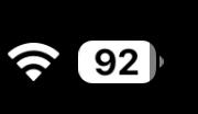
Just a percent
ThisIsAManWhoKnowsHowToGling@lemmy.dbzer0.com 1 year ago
A battery icon
ultrahamster64@lemmy.world 1 year ago
It looks almost exactly like the apple one
throwawayacc0430@sh.itjust.works 1 year ago
I heard that Samsung is trying to “Apple-ify” their One UI
Ghostalmedia@lemmy.world 1 year ago
It does not. Apple’s is a little battery. This looks more like a notification badge. Corner radius is too big, and it needs a nipple.
Imgonnatrythis@sh.itjust.works 1 year ago
Not much that isn’t better with a nipple. Not going to argue with that
amon@lemmy.world 1 year ago
Hey at least it shows the battery percentage unlike the old default option!
RejZoR@lemmy.ml 1 year ago
Old one with massive percentage number next to battery icon was so idiotic.
Strider@lemmy.world 1 year ago
It was more readable, to me.


nuko147@lemm.ee 1 year ago
Is this oneUI 7? If it is, tell me so i can stay in 6.1 when the update comes.
Kevo@lemmy.world 1 year ago
Yup. Avoid it if you can
Clinicallydepressedpoochie@lemmy.world 1 year ago
I think it’s 7