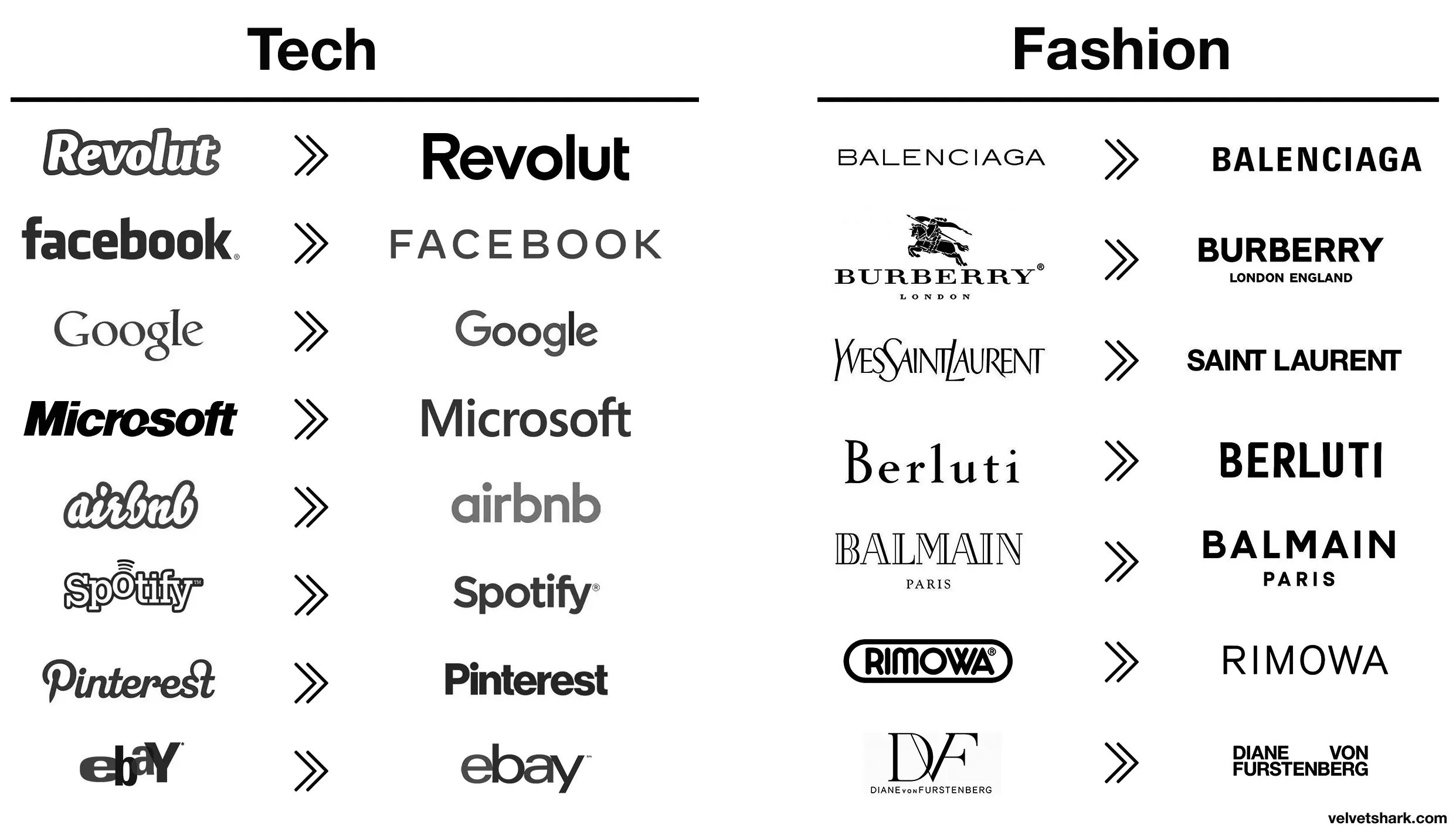
All these minimalist labels save .0005¢ every time they’re printed, probably even more on promo booths, banners, and the like.
Comment on You know what, fuck you [un-Jags uar icon]
m_f@midwest.social 1 year ago
RememberTheApollo_@lemmy.world 1 year ago
BrowseMan@sh.itjust.works 1 year ago
Aaaah then indeed that makes sense (and this is not ironic).
RememberTheApollo_@lemmy.world 1 year ago
Oh, I wasn’t being entirely serious, though there is an element of truth to it. It probably is a measurable cost savings over the scale of the business.
I still think these unremarkable corporate logos are boring AF. Just makes them visually soulless along with just being corporate soulless.
Viking_Hippie@lemmy.world 1 year ago
Better:
- Revolut (though a fintech company named after a revolution lacking the charge at the end is still moronic in several ways)
- airbnb (from awful to meh)
- Spotify (same)
Worse:
- Pinterest (original fit the platform and what it is/was pretty much perfectly. Current is meh)
- eBay (both are bad IMO, but at least the original was bad in a playful and eye-catching way. The new one is just more meh
- Burberry (the stag was notable and signalled a history of old-fashioned quality that’s suitably rugged. The new one is meh AND insecure about people knowing which London they’re from)
- Rimova (yet another fashion brand apparently afraid of being noticed
- DF (from one of the best and most fashion-appropriate logos to an absolute eyesore and kerning nightmare that invites vandalism)
- Jaguar (From absolutely iconic and great in every way to even uglier than the new DF one. I hope whomever came up with that got both fired and beaten and I’m a pacifist.)
The rest just go from meh to slightly different meh 🤷
Zwiebel@feddit.org 1 year ago
DF gets points dedacted for missing the ü dots on both, looks absolutely stupid to a german speaker
naught101@lemmy.world 1 year ago
I liked the old aibnb one.
Microsoft went from “boring with a bit of attitude” to just plain boring
FelixCress@lemmy.world 1 year ago
Spot on.
electric@lemmy.world 1 year ago
Those old fashion logos are actually sick. Concerning that an industry that sells style would make these their logos.
Bezier@suppo.fi 1 year ago
I wonder how much correlation there is between logo blandification and being owned by giant corporations.
naught101@lemmy.world 1 year ago
Except eBay, that was always trash.
FangedWyvern42@lemmy.world 1 year ago
Spotify and EBay made the right choices here, the new logos are way better.
AusatKeyboardPremi@lemmy.world 1 year ago
It is subjective, I liked the old eBay logo more, but dislike the old Airbnb one.
AnUnusualRelic@lemmy.world 1 year ago
Well, they certainly fin in better with all the others.