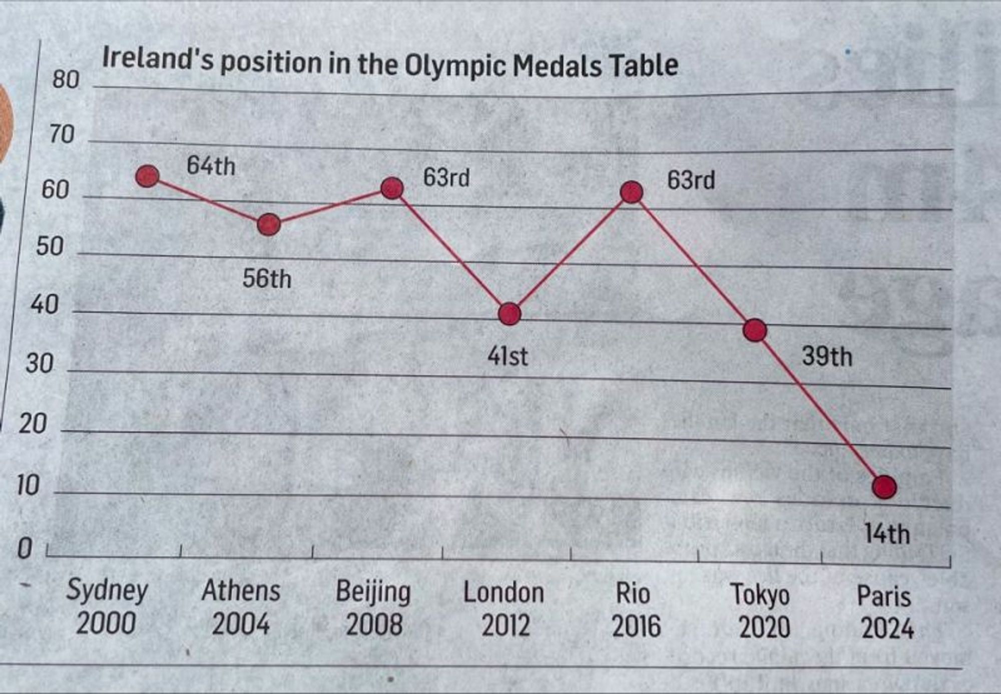
At this rate in 2028 they’ll be at -11th
Irish Journalist Excellence
Submitted 5 months ago by UnderpantsWeevil@lemmy.world to [deleted]
https://lemmy.world/pictrs/image/eb763139-0c10-4384-8698-061e4abf6fae.jpeg
Comments
leekleak@lemmy.world 5 months ago
nifty@lemmy.world 5 months ago
I like how the position axis starts at 0, maybe that’s for a year they don’t qualify
Ejh3k@lemmy.world 5 months ago
If the article is about how just a few countries are dominating the podiums, I think this is an incredibly effective graph.
usualsuspect191@lemmy.ca 5 months ago
At this rate, at the next Olympics they’ll be in -10.5 place!
ArbitraryValue@sh.itjust.works 5 months ago
The Y axis is the absolute number of medals and the labels for each data point are relative rankings. If one country got all the medals except one and Ireland got that one remaining medal, there would be a data point at Y=1 with the label “2nd”.
Trex202@lemmy.world 5 months ago
That thery might work if the data point labels didn’t directly correspond with the Y axis labels.
fubarx@lemmy.ml 5 months ago
WE’RE NUMBER ZERO! WE’RE NUMBER ZERO!
the_toast_is_gone@lemmy.world 5 months ago
This reminds me of that chart showing gun deaths over a few years that showed the line going down the more deaths there were. That made sense graphically, they colored it in to look like blood dripping down, but this is just dumb.
snue@feddit.dk 5 months ago
are their any communities for bad graphs ? :))
HEXN3T@lemmy.blahaj.zone 5 months ago
Are there any communities for misuse of their/there/they’re? /lh
Samsy@lemmy.ml 5 months ago
Their must be one. Plz create they.