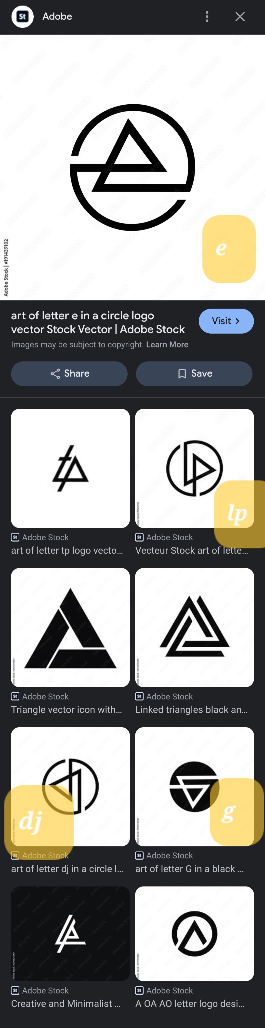
They’re all the same. Rotated 90° for each one. Except for the ‘e’, they flipped that one.
I swear one of them is literally just the Abstergo logo
Submitted 6 months ago by eightpix@lemmy.world to aboringdystopia@lemmy.world
https://lemmy.world/pictrs/image/e835f1cc-9c5f-449b-b397-a26b06b61205.jpeg
They’re all the same. Rotated 90° for each one. Except for the ‘e’, they flipped that one.
I swear one of them is literally just the Abstergo logo
Possibly exactly. I’m suspicious these were all made with AI based on copyrighted logos, at which point almost everything it’ll spit out is a copyrighted logo.
So we’ve got six Linkin Park ripoffs, the postmarketOS logo, and a valknut? Not sure what the last one is, but I’d be surprised if it were original.
So, I think some dude try to split their work so it is more likely to hit on Search bar, and make a sale.
Aurenkin@sh.itjust.works 6 months ago
Is it just me or do they really closely resemble the Linkin Park logo?
Image
AlexWIWA@lemmy.ml 6 months ago
These are all rip offs of the Linkin Park logo. One is literally the 2008 logo rotated. I thought this was a Linkin Park post when I saw it
No_Eponym@lemmy.ca 6 months ago
Image
AnarchoNoAdjective@lemmy.ml 6 months ago
Good shout, I was thinking the Audio Technica logo but LP logo is closer