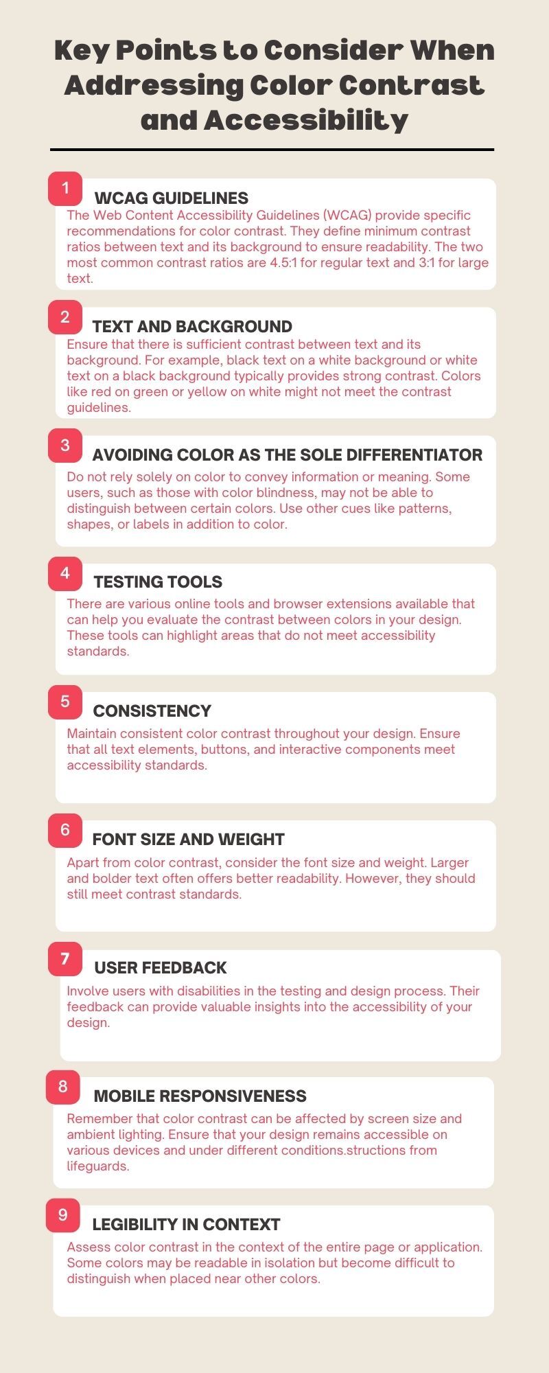
Dive into the vital aspects of creating an inclusive digital experience. This infographic presents key considerations for enhancing color contrast in design, ensuring accessibility for all. Explore the art of selecting accessible color palettes, understanding WCAG guidelines, and optimizing text and graphics. With these insights, you can make your content more inclusive and user-friendly for everyone.|
I’m not sure I can take this seriously with those color choices for this context.
hemko@lemmy.dbzer0.com 1 year ago
I don’t know if this is a woosh moment, but that is fucking terrible font color to read
Anamana@feddit.de 1 year ago
Look at #2 lol
alphacyberranger@lemmy.world 1 year ago
Agreed