 ghutchis@discuss.avogadro.cc
A while ago, @brockdyer03 suggested moving the “preview” text in the input generators to the side, rather than the bottom. Of course, this requires shifting depending on the language (e.g., RTL putting the text panel on the left).
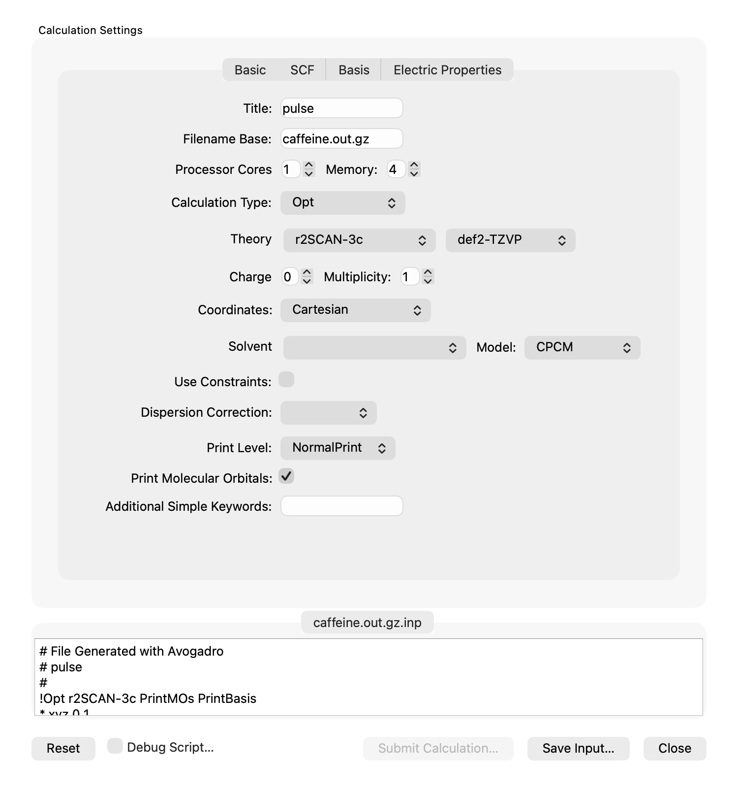
Here’s the current version:
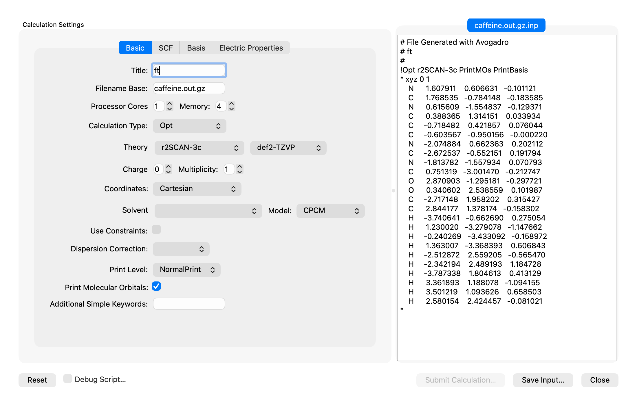
Here’s a prototype:
I think my main concern is that we’ve always wanted to de-prioritize the text / make it optional to see it. Now, the dialog is huge, defaulting to 1100×600.
Clearly we could have a Show Preview / Hide Preview button.
Thoughts? Feedback? Suggestions? Ideas?
 brockdyer03@discuss.avogadro.cc
A static screen picture does not provide as much user experience as the «the real thing» because screen estate (still) varies by outer dimension (14", 15", etc) and pixel density. This is the reason why I propose that this thread adds a link to GitHub; similar to the continuous builds now to a set of artifacts/builds of an Avogadro2 prototype with such an adjustable lateral pane. This would provide an opportunity to collect a feel of the two approaches in comparison and by e.g., November 15th the interested may cast their vote.
Sure, that’s a good idea. I’ll see if I can get a show / hide button hooked in and submit a pull request.