What’s the source of these graphs? I’ve seen them used before for a different country and they look really cool. I could probably waste a few hours just browsing different countries
Comment on China's green energy boom could spell the end of the fossil fuel age
Thedogdrinkscoffee@lemmy.ca 9 months ago
China’s electrification efforts are substantial and to be applauded and encouraged.
The problem is when you tell one sided stories, the important details get lost.
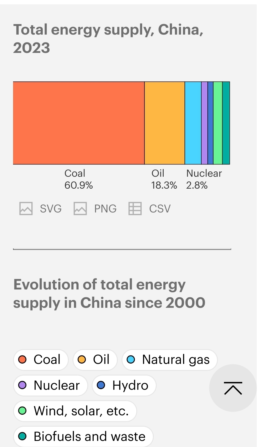
This is the most recent figure on China’s total energy mix from the IEA. They have a stupid long way to go on emissions.
It sounds nice to say they installed more solar in a month that australia has ever in it’s history. Let’s look at the trends…
Coal is up. Way up. Why did this article lose the narrative so badly? Because it’s a fluff piece, not an informed, intelligent discussion on emissions.
pdqcp@lemmy.dbzer0.com 9 months ago
Thedogdrinkscoffee@lemmy.ca 9 months ago
www.iea.org/countries/china/energy-mix
You can look at any country.
PlasticLove@lemmy.today 9 months ago
TheUnicornOfPerfidy@feddit.uk 9 months ago
Is there data for 2024 yet?
Thedogdrinkscoffee@lemmy.ca 9 months ago
Not that I saw. See another bost below with the iea website.