 snoopy@piefed.social@piefed.social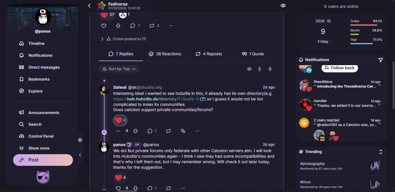
Today I merged many UI changes, mostly around how threads are viewed and navigated.
I took some of the good elements of Reddit, so now we have sorting by Old/New/Top (the default for the microblogging timelines is Old, and for forums it’s Top - both can change in settings) and a flexible replies section with collapsible/expandable branches.
Top-level posts now show the total number of replies under the whole thread, not just the direct/first level replies (but again you can change it back in Settings). I also saved much vertical space, so now you can read long threads with less scrolling.
If I may say so myself, I honestly believe it’s one of the best UIs on fedi, especially for reading conversations. I think that if anyone tried it, they would agree. Really, really happy with the results. It’s still fresh, so I will probably refine things here and there, but it’s pretty much exactly as I envisioned it.
Let us know what you think!
#catodon